Friday 9 April 2010
Message from Ms Prince
Your blog has now been marked for research and planning. Anything that you may now add will not be counted towards your final mark.
Monday 29 March 2010
Front Cover Final

**I aimed to keep it simple and sophisticated.
**I have used an attractive to attract males and also females.I have tried to keep my model as simple but classy as possible to show that the RnB genre is full of richness, money, power but it is achievable and that the audience can achieve and make it to the top. My aim is for the audience to relate to Rita Ortiz and give them hope in achieving their aims and goals. I have challenged this idea as most if not all music magazines have classy models with a lot of jewellery to show authority and power.
**I made it obvious that I wanted to attracted a young adult audience.
** I have used a minimum of 3/ 4 different colour as this is conventional.
** Masthead is strong and powerful and looks very RnB.The masthead I have used is dynamic and powerful. It looks ‘Blingy’. I tried to keep it minimal and not make it masculine as magazines such as XXL and Vibe have used. I have challenged this to an extend to make it look as if there is so much more to the RnB genre than power and authority. I added an outer glow to show that there is brightness in this type of genre.
**The cover lines in which I have used are very bold and I have used the colour white to connote purity, simplicity but also a hint of professionalism. This is something in which RnB music magazines consist of. My cover lines are snappy, straight to the point but make the audience want to read more. I believe that this is conventional as it can be found in many magazines consisting of my genre. I have also aimed to attract the Hip Hop audience therefore making it more mainstream.
I have used simple but eye catching colours. I have aimed to attract males and females without dominating any sex. Although my main image is a female I have made sure she doesn’t look too feminine.
My Double Spread Final


** I have used direct mode of address to get grab the audiences attention but to also involve them. I did this to make the audience feel as important as her.
** The red colour suggests love , power and passion. I have done this to show that the audience will fall in love with the model and feel like they have a connection. It contasts to the white and black which makes it stand out and easier to read.
** The models costume is very simple as it links in to the fact that she is simple and ordinary just like the reader. This mise-en-scene is effective as the audience can relate to the model and it gives them thev motivation to do well.
** From the floating quotes I have aimed to send out a message to the reader to make them believe that anyone can do anything if they put their mind to it.
** I have also produced a film strip of photos of my model. This is very unique. I did this to show the model in different places at different times enjoying herself and having fun. Again i have kept her costume to a miniumum as she is not like the rest of the other Divas out there she is different and down to earth. I believe that this is why my interview sticks out.
Sunday 28 March 2010
A sound audio profile of R&BXclusive
Check out this SlideShare Presentation:
Ornela
View more documents from guest517941.
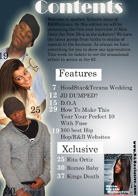
Primarily Task Front Conver +Contents Page


This is my contents page for my Primarily task. This has helped me improve my Photoshop Skills.
Magazines In Which I Have Looked At To
Check out this SlideShare Presentation:
Magazines In Which I Have Looked At To
View more presentations from guest1f6820.
Subscribe to:
Posts (Atom)