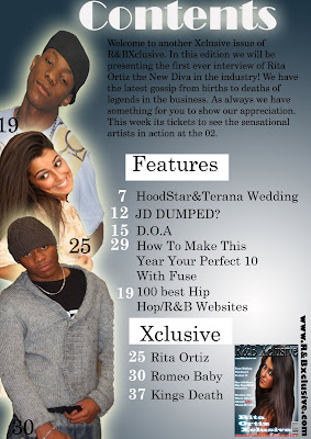

**I aimed to keep it simple and sophisticated.
**I have used an attractive to attract males and also females.I have tried to keep my model as simple but classy as possible to show that the RnB genre is full of richness, money, power but it is achievable and that the audience can achieve and make it to the top. My aim is for the audience to relate to Rita Ortiz and give them hope in achieving their aims and goals. I have challenged this idea as most if not all music magazines have classy models with a lot of jewellery to show authority and power.
**I made it obvious that I wanted to attracted a young adult audience.
** I have used a minimum of 3/ 4 different colour as this is conventional.
** Masthead is strong and powerful and looks very RnB.The masthead I have used is dynamic and powerful. It looks ‘Blingy’. I tried to keep it minimal and not make it masculine as magazines such as XXL and Vibe have used. I have challenged this to an extend to make it look as if there is so much more to the RnB genre than power and authority. I added an outer glow to show that there is brightness in this type of genre.
**The cover lines in which I have used are very bold and I have used the colour white to connote purity, simplicity but also a hint of professionalism. This is something in which RnB music magazines consist of. My cover lines are snappy, straight to the point but make the audience want to read more. I believe that this is conventional as it can be found in many magazines consisting of my genre. I have also aimed to attract the Hip Hop audience therefore making it more mainstream.
I have used simple but eye catching colours. I have aimed to attract males and females without dominating any sex. Although my main image is a female I have made sure she doesn’t look too feminine.
No comments:
Post a Comment